|
|
|
| |
Ads by Google, based on your browsing history
|
|
2020
May
31
|
Is this 2020 or 1968?
[Some details corrected.]
Because of the coronavirus lockdown, the last few weeks have already reminded me
of the summers of 1968, 1969, and 1970, when I was home from middle school and
did not yet have the outside activities or social life of high school.
That was the last time in my life that I voluntarily spent most days entirely at
home, reading and pursuing scientific interests, mostly astronomy and electronics.
That's just what I do now, except that I also have a job and social media, neither
of which requires leaving the house.
Yesterday (May 30) was particularly 1960s-ish in two ways. One was that I watched
on TV (or rather my computer screen) the launch of a crewed space flight from Cape
Canaveral, our country's first in nine years.

NASA image
The second, sadder, was that the news was filled with reports of race riots in
Minneapolis, Atlanta, Louisville, and many other places.
The issue was the prima facie unjustified killing of several black people
in the name of law enforcement:
George Floyd in Minneapolis, and, earlier, Ahmaud Arbery in Brunswick, Ga.,
and a young woman in Louisville, as well as other discriminatory
incidents.
About the riots I will say just four things.
- Nonviolent protests were welcome — many public officials said so — and the
violence was unexpected.
- We still need to know to what extent the violence came from the same people as the
nonviolent protests. Quite possibly they were entirely different, the latter deliberately
trying to discredit the former. I don't want to hear what your political ideology tells
you to believe about this — this needs to be investigated as a question of fact.
- To ask what provoked a riot is not the same as to endorse the rioting.
- The social-media gossip-and-propaganda mill is in full operation now.
Facebook and Twitter are abuzz with videos and anecdotes of unconfirmed origin.
Everyone, please remember that videos may not be what they appear and even
the logo of a TV station is easy to insert into a fake video.
I think America has lost sight of racism and poverty because those issues are not controversial
enough for the left wing and not individualistic enough for the right wing.
I also think a rising tide of contempt is the deeper problem.
Our political discourse for the past several years has normalized the previously
deplorable notion that it's OK, even virtuous, to despise large numbers of your
fellow citizens, and that your goal should be to get power for your own group and
disenfranchise the rest. We have had this from the left and the right.
It must stop.
Permanent link to this entry

|
2020
May
30
|
Short notes
The month of May is keeping me busy! I've been doing a lot of things other than blogging,
especially lots of research and development for my two consulting clients.
Here I want to jot down a few things that I may later write about at length.
Software to record software demos: I highly recommend
OBS, and when you install it, be sure to check all the settings.
This provides a very easy way to make a video recording of yourself using software
(recording either the full screen, or a cropped part
of the full screen, or one window) while you talk about it.
It has other video editing functions that I haven't delved into; it may be all you
need (plus a camera) to make reasonably complete videos.
Built into Windows is
the Windows Xbox Game Bar (just hit Win+G), with which
you can record one window, with commentary,
but not the full screen. And, curiously, the title bar of the window is left out. The same
applies when you record a window in OBS. It must have something to do with how the Windows video
system makes the contents of windows available.
How I explain things: People have complimented me on how clearly I explain things.
I'm going to blog about how I do it. The key to it is that before I explain something,
I have to understand it myself and be able to put it in words more than one way.
Some people think they're explaining or understanding when they are just reproducing someone
else's words. If you can't put something into words more than one way, you don't really
understand it yourself.
Do people want the pandemic to end? It continues to recede gradually
in Georgia; even in the face of a rapid rise in testing, the number of cases found is
slowly subsiding.
IHME thinks that, when you take testing into account,
the number of actual new cases per day in Georgia peaked April 1 and is
now down to about a quarter of peak.
I take this to be good news, but,
strangely, I run into people who don't want good news,
perhaps because the end of the pandemic would bring them new responsibilities.
The pandemic is not over, and I'm not lowering my guard, but I am
trying to stay in touch with reality, not a "narrative" spun by either people who are stuck in panic
or people who are in denial.
Life in wartime: Stores are opening back up, and you can even eat at a restaurant if you
want to, but we still aren't getting out much. Working at home is very efficient.
For exercise, I walk around the neighborhood. What amazes me is that the toilet-paper industry
still hasn't adapted to the new conditions. We never actually ran out of toilet paper, but most
grocery stores don't have any of it most of the time. So, like everybody else, we look for it
every time we're in a store, and we score it just often enough to keep ourselves supplied.
Two days ago, at Publix, the policy was "limit one item" but my one item happened to be an
industrial-size box of 24 rolls, so we're good for a few weeks now.
Permanent link to this entry
|
2020
May
24
|
What do you do with a red galaxy?
Removing strong color casts in PixInsight
Note: For more context
see June 7, 2021.
If your calibrated and stacked deep-sky images look like the upper left one
in this picture — or have some other strong color cast — read on.
Mine often do.
Here are some notes about things I learned while experimenting after watching an
excellent video
in which Amy Astro tackles the same problem.
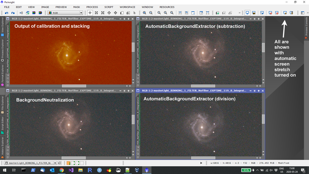
If you're like me, you've found that AutomaticBackgroundExtractor takes away the
color cast nicely, and so does BackgroundNeutralization.
(Either of these is done to the linear image, before any histogram stretching.)
But is that the best
way to do it?
Look carefully again at the four images. The lower left and upper right are alike
despite being produced differently. The background is neutral. The galaxy is cream-colored,
which is not unreasonable for a galaxy with a lot of dust in it.
But — wait a minute — a lot of stars are cream-colored, too. And that's not
quite right.
Closer examination convinced me that the image on the lower right is actually the best one.
Superficially, it looks less colorful, but when I viewed it magnified, it showed the colors
of the galaxy more realistically, with the core yellowish and the brightest spiral arms
bluish.
And it was obtained by using AutomaticBackgroundExtractor to do division rather than
subtraction. But stick with me...
What is a color cast?
There are two reasons an image might be pervaded by an extraneous color:
- Colored light added to the image, such as orange from a streetlight or red
from an observatory lamp; or
- A color cast
from incorrect proportions of R, G, and B in every pixel; for example, every pixel's
R value might be 10% higher than it should be.
A colored cast affects every pixel equally; it's like taking pictures through a colored filter.
Added colored light affects the dark background more than the bright foreground,
because 10 + 10 = 20, which is double, but 10 + 100 = 110, which is only 10% more.
And what is AutomaticBackgroundExtractor?
AutomaticBackgroundExtractor is normally used to remove gradients or vignetting from
images. When one side of the image is lighter than the other, it may because light was
added from skyglow (common where I live; the far southern sky picks up more city lights)
or it might be because the light path was partly obstructed (e.g., by vignetting).
The latter is preferably corrected by flat fields, but sometimes an image still needs help.
Note that these two problems are corrected in different ways.
Gradients from skyglow are from light added to the image that needs to be subtracted.
But effects from obstruction are multiplicative (e.g., one part of the image
gets 1.5× as much light as another) and need to be divided out.
That's why AutomaticBackgroundExtractor gives you a choice of subtraction or division.
A new way to use AutomaticBackgroundExtractor
We've established that we want to use division, not subtraction, to remove a color cast.
But here's one more thing.
AutomaticBackgroundExtractor's normal job is to model a gradient, possibly a complex
one, so that it can flatten out an uneven background. For that purpose it fits a polynomial
function in each direction (x and y).
When we're correcting a color cast, we don't want it to do that.
We want to correct the whole image equally. Real gradients can be dealt with afterward.
The trick is to set the degree of the equation to 0:
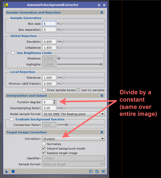
Then you have a color-cast-remover that is not a background flattener.
One minor puzzle is why BackgroundNeutralization doesn't do exactly this.
It's close, but not quite the same.
I've
confirmed that it operates subtractively, and that
surprises me, because I thought it would operate by division. The documentation does
not make this perfectly clear.
Another way to remove (or add) a color cast
The heavy-handed way to multiply R, G, and B by different factors, all the way across
an image, is to use the sliders in the AssistedColorCalibration tool, like this:
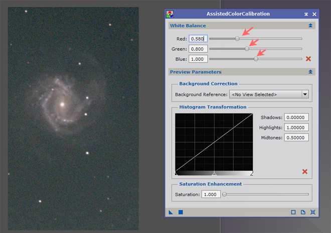
This has to be done by trial and error, but if you have the same color cast recurring
(e.g., from a nebula filter), you may want to use the same numbers every time, once
you've determined them.
So where did this color cast come from?
A deeper question: Why was my galaxy red? (And also the one Amy was working on, taken
with a completely different kind of camera?)
For some time I labored under the assumption that the glow of city lights must be
very red (at least in the extended spectrum to which this modified camera responds),
and that the red color came from added light.
So I used AutomaticBackgroundExtraction in subtraction mode, and it left
the stars cream-colored.
Then I looked at my flat-field frames. Surprise — they're not gray — they're
strongly cyan! Here's how they look played back on the camera:
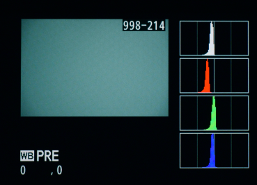
My light source is an artist's tracing pad made by AGPtek.
It looks a little bluish to the human eye, but obviously it's very weak in red
from this camera's point of view — it must leave out a good bit of the far
red end of the spectrum.
I don't know as much of the story about the picture Amy was working on.
It came from The
Backyard Astro Imaging Club and was taken with an Altair astrocamera.
What I know is that when I deBayered it, it was cyan — almost Cambridge blue.
Well, the calibrated image is going to have the opposite color cast than the flat field,
because that's how flat fields work! Years ago, we used to color-neutralize our flats by
binning the pixels 2 by 2, but that destroys some information about pixel-response non-uniformity
(PRNU) and results in a noisier image.
So I may or may not try to get more color-neutral flats. A good bit of experimentation
remains to be done.
Loose ends
Both BackgroundNeutralization and AutomaticBackgroundExtraction work by looking only at the
background (the space between the stars) and assuming that the background should be neutral gray.
Thus, they won't be thrown off by a large, strongly colored object in the picture, such as a
red nebula.
As far as I can determine, the stacking procedure I was using (Weighted BatchPreprocessing) ignores
the white balance setting for RAW in Format Explorer. But when I stack with DeepSkyStacker, I get
a golden brown background rather than strong red. Hmmm...
The flaw in my process so far is that I'm assuming the background should be neutral.
The skyglow in my town certainly isn't red; in the era of LED streetlights, it is probably
dark gray (dim white). But the camera seems to think it may be brownish. I need to investigate
further. (In fact, a moment's further investigation told me the unmodified Nikon D5300 sees
the sky background as deep purple. Obviously, spectral response makes a big difference.)
Permanent link to this entry
|
2020
May
20
|
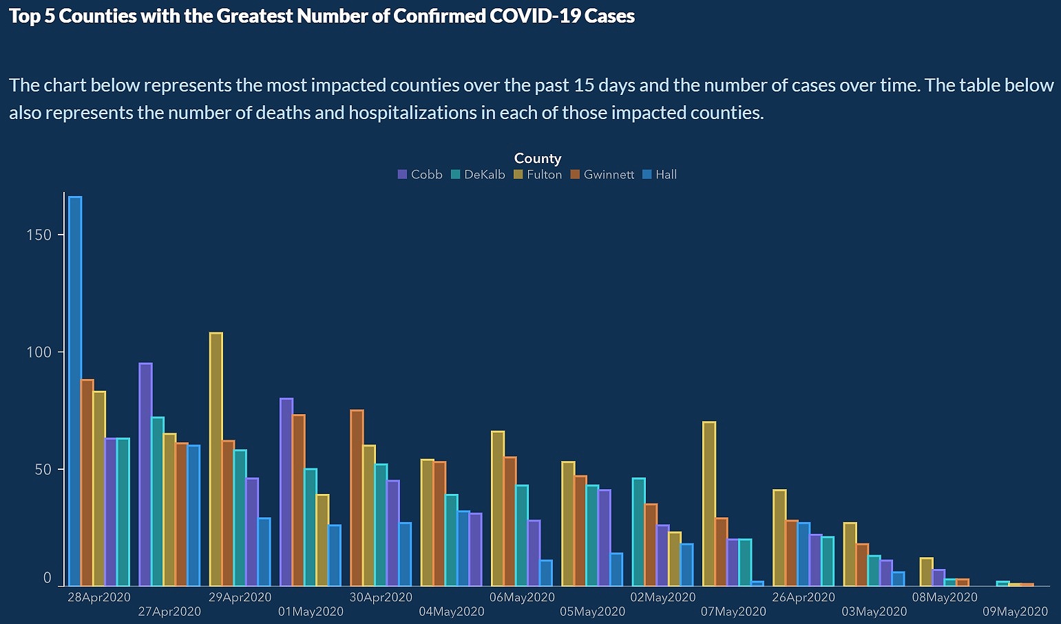
Did Georgia misreport COVID data to justify lifting its lockdown?
Update, with correction: Another issue has arisen since the material below was written.
Some state governments, including Georgia,
did not distinguish between PCR tests (for the actual virus)
and antibody tests (for the body's response to the virus),
and this inflated the CDC's numbers of total tests given.
Note that this does not affect the numbers I am tracking (cases, not tests),
though it may affect IHME models. It's a mistake, but
not deliberate fakery. In fact, arguably, what happened is that different places
chose to report tests differently, and the CDC didn't realize it.
I don't agree with
The Atlantic's claim
that it renders the whole picture "uninterpretable." If the same mistake has been being
made for some time, then we can still track changes in the numbers.
Numbers are nothing without context.
|
The national press is abuzz with the allegation that Georgia misreported COVID data
in order to justify lifting its lockdown.
Crucially, nobody has alleged any specific misreporting of numbers — the
whole story is vague and consists of conclusion and opinions but no data.
I've been looking into it, and here's what I found:
- A strange bar graph with the dates out of order, published by Georgia DPH around May 10
and then taken down;
- Another type of graph that is standard but easily misunderstood;
- Frequent updates of data to correct brief reporting errors;
- A newspaper that didn't quite understand all this, and other newspapers that swallowed
the accusation without checking it out, leading to factually false reporting in the
Los Angeles Times.
Now I must emphasize that if anything dishonest was done, it needs to be brought to light.
But nobody has even claimed any false reporting of numbers here. This has all been about people
looking at graphs and calling them misleading.
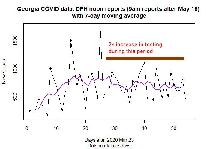
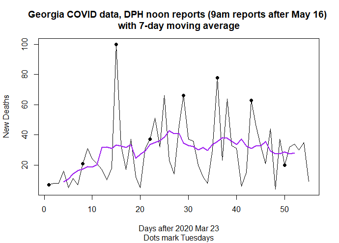
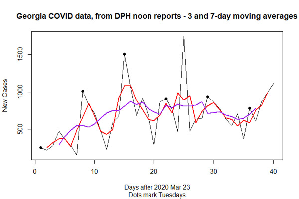
First, the actual data
I've been collecting the Georgia DPH numbers every morning — the same numbers that are compiled
by Johns Hopkins and others — and making my own graphs. Here's where we stand as of this morning:
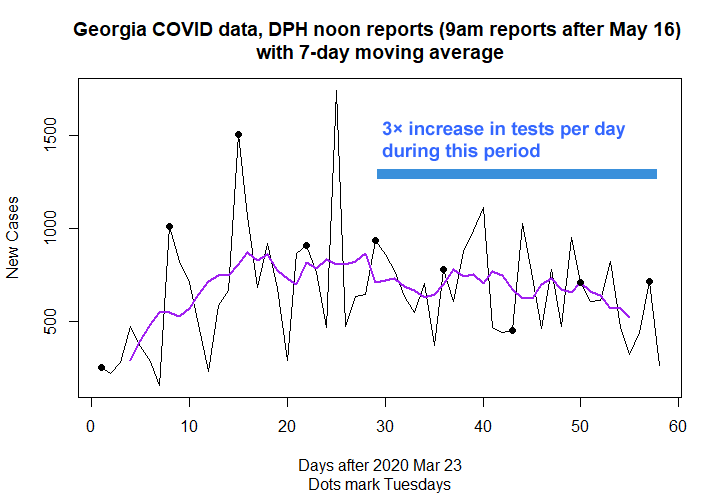
I must emphasize that this is not a model; the moving average is a summary of the actual numbers
that were input into the graph.
As you can see, the pandemic is subsiding in Georgia, which is all the more impressive because
testing is expanding. Many other parts of the country are having similar experiences.
Georgia's hospital occupancy rate and death rate from COVID-19 have also been going down steadily
for weeks.
The goofy graph
The newspapers reporting on Georgia's strange bar graph did not republish it; you cannot see it there.
Thanks to someone who preserved it on a web page, though, I can show it to you.
(As a state document, it is presumably not copyrighted.)
Here's part of it; click to see the whole thing.
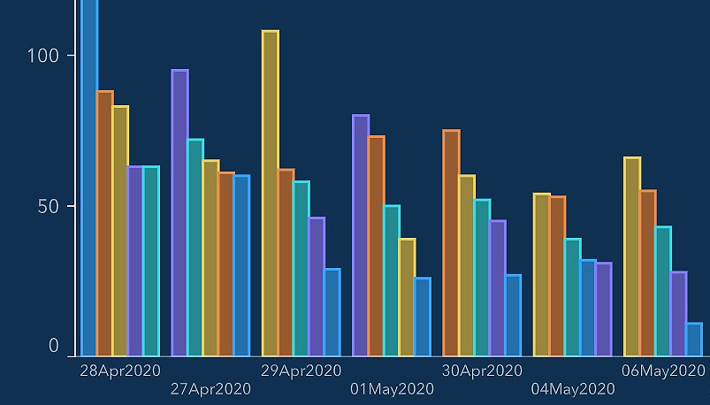
The bars stand for different counties. And, crucially, the dates are out of order, as you can see by
reading at the bottom. The whole graph gives the impression of a steady, even exponential, decrease, until you
realize the dates are out of order.
When I saw this graph on the Georgia DPH web site, I immediately supposed somebody had made a mistake
with the software that generates it. That's what I still think. Instead of being sorted by date, the graph
is sorted by something else, probably the sum of the five bars.
This graph can only deceive you if you don't read any of the writing on it. The dates are written for you to look at.
As for the five bars — well, Georgia is one state, not five, and the caption clearly explains what counties
they represent (5 of Georgia's 159).
The graph may have deceived people inside the state government and outside it, but I don't think it
was intended to deceive. If it were a deliberate fake, it wouldn't show those out-of-order dates.
I still think it was just a software mishap.
Of course I think DPH should not have published it.
Somebody wasn't paying attention. But I do not attribute to malice what can be
explained by ineptitude, overwork, or accident.
Another kind of graph that often misleads
Another kind of graph that we've been seeing regularly (from the CDC and various states, not just
Georgia) plots cases by date of symptom onset, and there's a problem.
Cases that started in the most recent two weeks, or somewhat more, have not incubated and been
caught on tests. Here's today's Georgia graph, with my annotations in red:
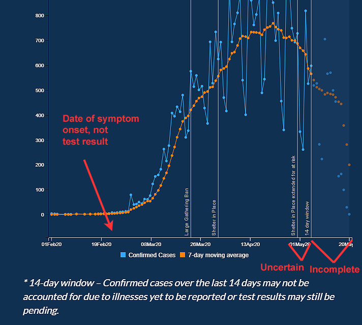
On this kind of graph you will always see a drop-off in the final two weeks or slightly more;
we saw that even back when the epidemic was expanding rapidly. And we saw it in the CDC's graphs,
not just Georgia's.
Personally, I think it would be more honest to simply cut off the last two weeks of the graph.
Georgia does mark that period with shading. The case for not cutting it off is that even though it
has a misleading slope, you can still compare it with earlier graphs of the same kind.
Reporting errors happen and are updated
Everywhere in the world, including Georgia, authorities who are trying to release up-to-date data
sometimes have to correct it. Georgia has done this several times recently.
It is easy for critics to jump on this, and we could wish that DPH were better funded and staffed,
but correcting an error is not malicious misreporting. It's close to being the opposite.
How the press ran with it
Allegations that Georgia was distorting its data started in the
Atlanta
Journal-Constitution and were picked up by the
Washington Post,
Los Angeles Times,
and CNN,
getting vaguer at every step.
None of these actually published the garbled graph, and none of them asserted that any specific numbers
had been falsified. CNN seems to want to combine the Georgia episode with a case of a scientist
being fired (probably for bad reasons) in Florida.
The AJC story does show that someone within the state government was misled by the out-of-order graph,
perhaps not realizing it was a complete mistake. But that's as near as we get to deliberate misrepresentation.
The Los Angeles Times reported a clear falsehood.
Their headline was, "Georgia’s coronavirus data made reopening look safe. The numbers were a lie."
They asserted that the out-of-order graph
was the whole justification for Georgia's reopening — that there was
no other sign of a downward trend. Nonsense. Los Angeles Times, you have mud on your face.
Permanent link to this entry
|
2020
May
17
|
M61 with supernova
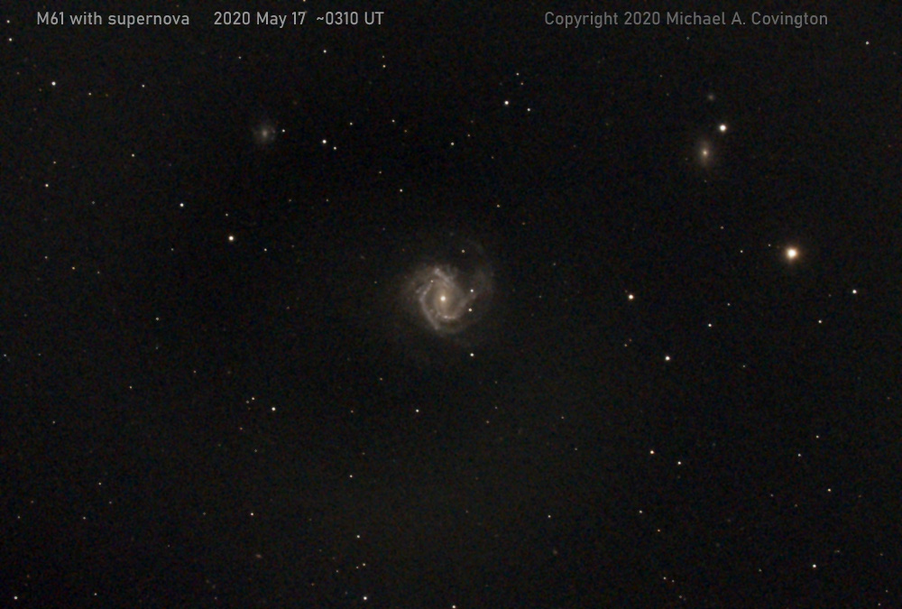
Last night (May 16, or May 17 UTC) I went after M61 and its supernova with a telescope
more adequate for the task.
Celestron 8 EdgeHD with f/7 reducer; CGEM mount with autoguider;
stack of 9 2-minute exposures with a Nikon D5500 (H-alpha) at ISO 400.
Here it is with labels added:
Permanent link to this entry
Is this folly, or can we smell victory?
Georgia loosened its lockdown about three weeks ago, and the predicted second wave of new cases
and deaths has not materialized. Here are some data (not models, but real data):
Note that the new-case rate fell slowly during a large increase in testing, a time when
we ought to be finding more new cases every day; and also that the death rate (which lags it by a
couple of weeks) is also falling.
What to make of this is bitterly controversial, and I want everyone to practice the mental
feat of considering more than one possibility. I am not going to say that just because something
is possible, it must be so.
Some say the second wave is waiting in the wings, about to make a dramatic entrance.
That's possible, but I see no sign of it yet.
Bear in mind that Georgians have been rather shy about loosening their lockdown.
By no means have we opened everything back up.
And a lot of us are remaining more reclusive than the rules require.
I, for instance, have two high-risk individuals in the house and don't want to expose them.
Bear in mind also that "herd immunity" is a pig in a poke. It is quite unclear how long a person
is immune to COVID-19 after getting it. If we were sure that infection conferred lasting immunity,
this would be a different situation.
Last, bear in mind that there's a difference between what you think likely and what you
are willing to bet people's lives on. People in positions of responsibility are cautious.
But I think it's very important that major increases in testing have not increased the number
of new cases found per day. And I'm not the only person who thinks this.
The people at IHME, the research institute
whose pessimistic forecasts shaped national policy for the past couple of months,
have suddenly become more optimistic.
They estimate that the rate of actual infection has actually been falling nicely for weeks,
and meanwhile we've been detecting a steadily rising percentage of the infections.
Here's their graph for Georgia as of May 12,
bearing in mind that the dotted lines are estimated:
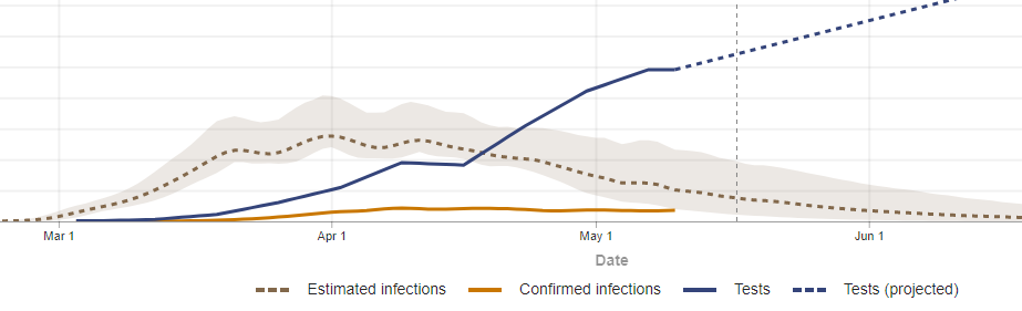
If true, this is very good news.
I post this not to provoke bitter debate, but to record for posterity the state
of the question as of May 17, 2020.
Additional note: Don't mistake New York for North America.
As Keith Gleason
explained at length in a public Facebook posting, when the epidemic was at its worst,
New York State had a third of the United States' new cases per day and nearly half of its
COVID-19 deaths. (That was around April 10 and April 17 respectively.) Now New York is seeing
dramatic improvement, and that makes it look like the rates for the whole country are falling
rapidly when in fact they are only subsiding slowly, like Georgia's when in fact they are nearly flat.
Permanent link to this entry
|
2020
May
12
|
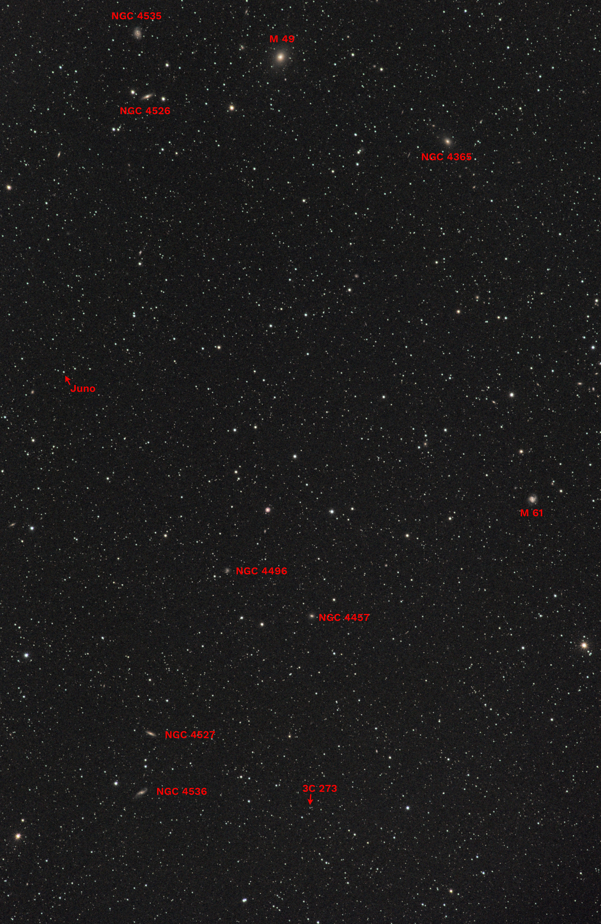
One picture, a lot of the universe
On the evening of the 10th I took just one astronomical photograph, but it shows
more of the universe than you might expect.
This is a star field in the direction of the constellation Virgo, where many distant
galaxies are visible, and you can see quite a few of them.
I've labeled a few of the brightest galaxies with M or NGC numbers, and many more
are visible as faint smudges. Each of them is bigger than the entire starry sky
as you see it with your unaided eyes.
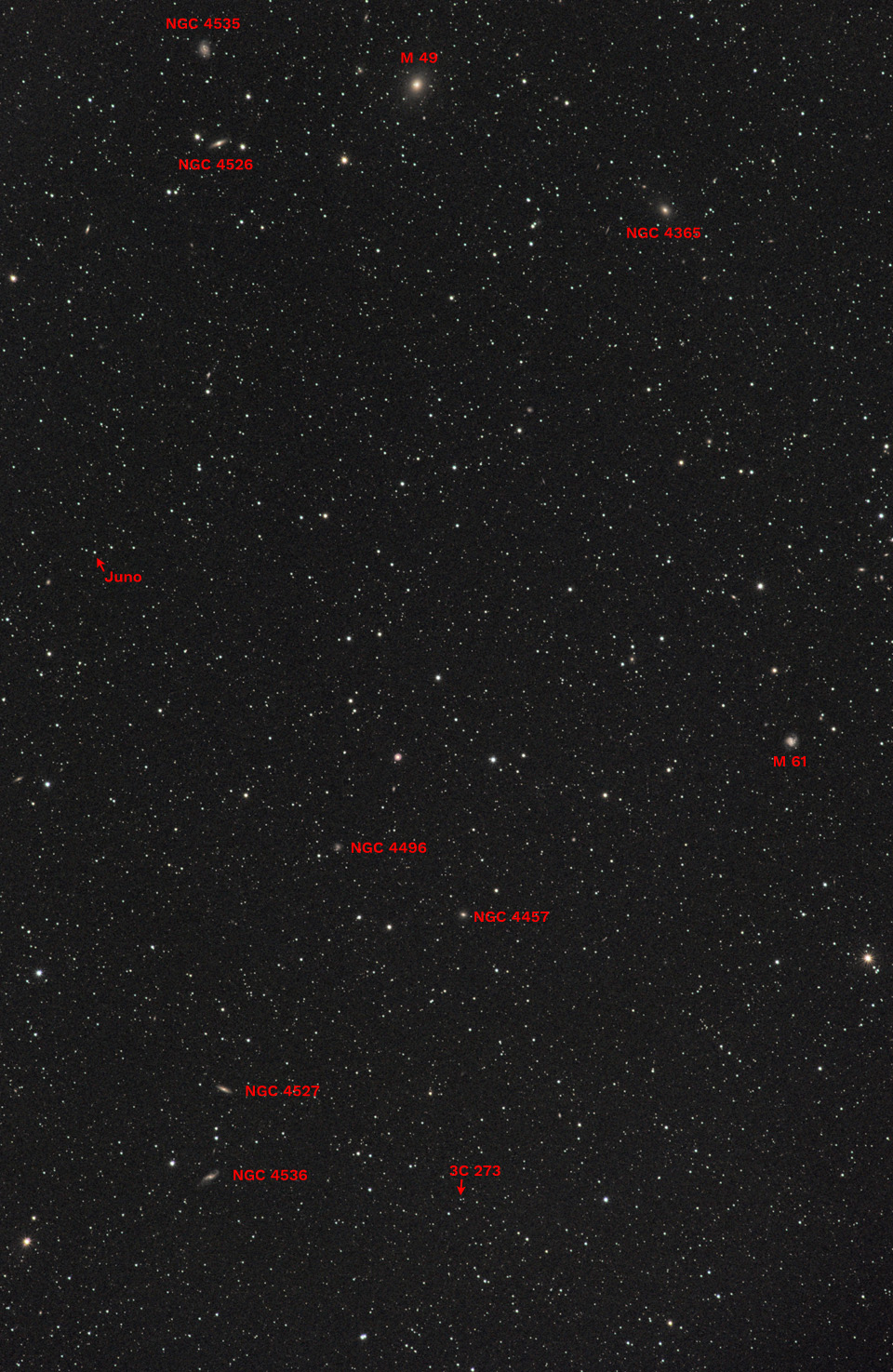
Click for higher-resolution version.
Then click again to actually see it enlarged.
I've also marked the asteroid Juno,
which looks like a star but is actually a 200-mile-long rock that orbits the sun
between the orbits of Mars and Jupiter. It was discovered in 1804 and originally
classified as a (very small) planet, so if you look at books of that era, you will see
the number of planets going up from year to year until the asteroids were reclassified
as a different kind of object.
I've also marked the quasar 3C 273, which looks like a star
(the leftmost of a close pair) but is actually, as far as we can tell, one of the most
distant objects that earth-based telescopes can see. "Quasar" is short for
"quasi-stellar," which means "like a star," but physically, it is basically the nucleus
of an active galaxy, and we can't see the rest of the galaxy because of the distance.
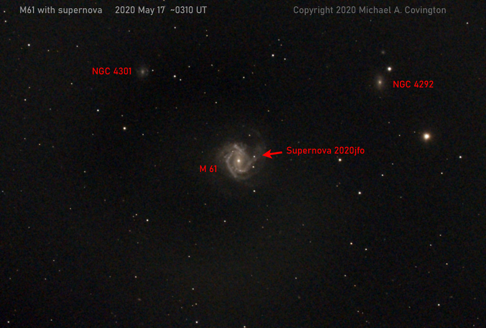
Finally, the galaxy M61 (midway up the right edge of the picture) happened to contain
a supernova, as I found out afterward, and it shows up in the picture. Here's an enlargement
of that region with the supernova marked:

What enormous telescope did I use to do all this?
Just a battle-worn Nikon 180/2.8 ED AI telephoto lens
and Nikon D5500 camera on a Celestron AVX equatorial mount.
This is a stack of twenty 2-minute exposures at f/4, ISO 400.
Permanent link to this entry
|
2020
May
10
|
Happy Mother's Day!
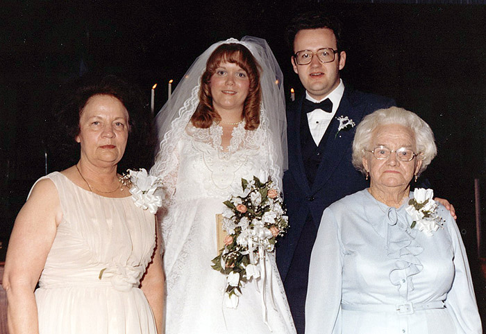
In this picture, taken at our wedding on July 25, 1982, you see me,
my bride (Melody), my mother
(Hazel Roberts Covington, 1925-1985),
and my grandmother
(Annie Belle Trawick Roberts, 1904-1992).
I wish a blessed Mother's Day to everyone who is a mother or has one!
Permanent link to this entry
"Rule of 500" and guiding tolerance depend on finished picture size, not sensor resolution
If you take fixed-tripod astrophotos, you probably use the "Rule of 500" to figure out how
long you can expose without having the picture smeared by the earth's rotation.
If you track or guide, you need to know the guiding tolerance.
Either way, the answer depends on the size of the finished picture, not the pixels in the
sensor, because you're not going to be showing anyone the pixels in the sensor.
Someone asked me a question about this, and I did all the math.
Read about it here.
Permanent link to this entry
|
2020
May
8
|
Globular cluster M3
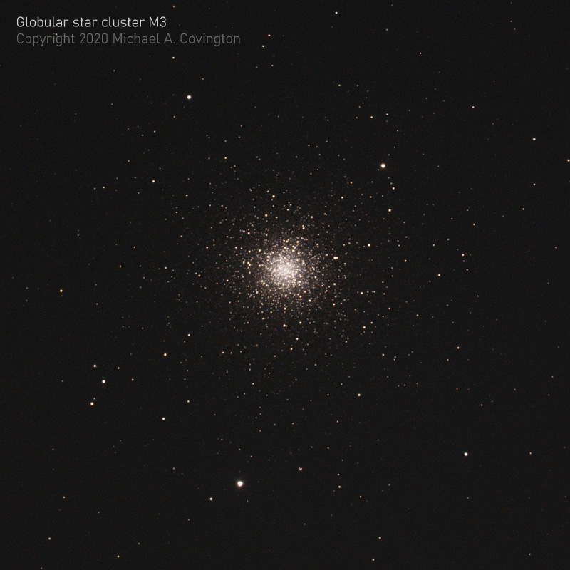
Last night (the evening of May 7), I got out my big telescope — my C8 EdgeHD
with f/7 compressor — and attempted autoguided deep-sky photography.
This is usually a tricky endeavor because it demands more precision than any
affordable mount can deliver.
To my delight, this time the CGEM mount served me well. I have recently adjusted
its declination worm gear several times, first too tight and then too loose and
then more or less right. The declination backlash is now 50 arc-seconds,
which is stil rather large but does allow the autoguiding
software to calibrate on both axes.
I got excellent guiding. Six of my 20 2-minute exposures were blurred by passing clouds
or were just a bit imperfectly guided. What you see above is a stack of 14 2-minute
exposures with a Nikon D5500 at ISO 400.
Permanent link to this entry
No, I won't watch that video
This week a lot of people had their eyes opened to the fact that
something can sound scientific and authoritative and yet not be true.
And I did some of the opening.
Two dubious videos about COVID swept through social media this week.
The first
was by two urgent-care doctors in California. The second, titled
PlanDemic, was by a notorious antivaxer.
I was besieged by people urging me to watch them. To this day I have not watched either one.
The first video drew a
response from the American College of Emergency Physicians pointing out
mathematical errors
(see also The
Logic Of Science for more).
Almost as soon as the second video came out, Kat Montgomery, M.D., posted
this rebuttal
on Facebook, with references. By now, major media are publishing responses
(e.g., this
nontechnical article in Forbes).
Alongside reviews like these, I found absolutely no qualified person endorsing either
video. So I didn't think they were worth watching.
And — this is really important — I am not qualified to evaluate the videos myself.
That's right. I am not a doctor or biologist. If somebody tells me there are no vaccines for RNA viruses
(as PlanDemic reportedly claims), I'm not going to know whether that's true unless I check with
someone more qualified.
And that's part of why I don't trust the videos.
Scientific claims should be put before experts, not hidden from them.
If anyone actually cracked a significant part of the coronavirus problem, the
medical community would be glad to hear it.
But when a "discovery" is promoted directly to laypeople, in a video so lengthy that
busy doctors won't have time to watch it, it "doesn't pass the smell test," as we say.
Bottom line: It's not my job to watch videos that I have no reason to think reliable.
In fact, it's wiser not to watch or read questionable material
that I don't have the qualifications or time to check out.
Why would I want to fill my mind with "facts" that might not be true?
But it took a truly regrettable amount of time and energy, over the past few days,
to explain this to all the people on Facebook who were pushing me to watch the videos!
Permanent link to this entry
|
2020
May
6
|
The delights of mechanical keyboards
A mechanical computer keyboard is, roughly speaking, one on which you type by doing more
than pressing pieces of conductive plastic lightly together.
Mechanical keyboards click, and before they click, the key goes down an appreciable
distance, and you feel it click into position.
The classic mechanical keyboard is that of the IBM PC (1981). For the past few days
I've been typing with one of its early descendants, the keyboard of an IBM PS/2 Model 25
made in 1987. I got this keyboard in the early 1990s and used it for years, until I moved
to computers that required a USB keyboard, but I recently got a PS/2-to-USB adapter and put
it back into service.
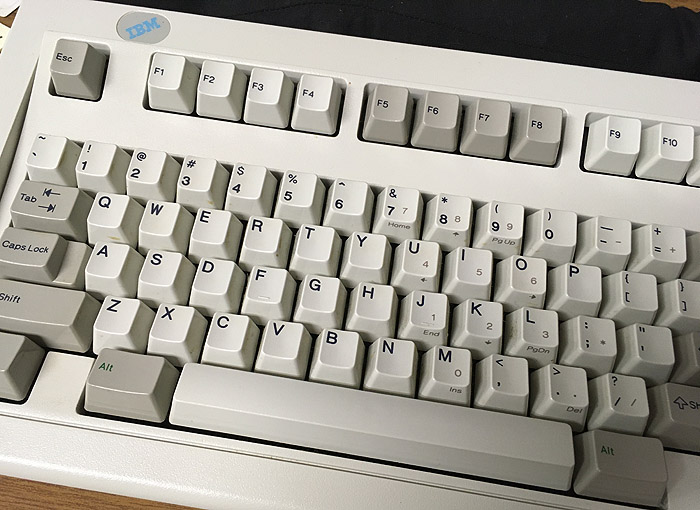
What was it like? Familiar. Also, loud. Keyboards of this type make
clicking noises. They are much quieter than typewriters, which were their competition in
1981, but they do make noise.
Today, most keyboards are quite silent, and we can use our laptops in libraries and
meetings. But in those days, you were supposed to be able to hear yourself type.
Many people feel that they type more accurately with a mechanical keyboard.
After about a day of getting reaccustomed to it, I feel that way myself.
It helps to be able to hear each key go down (and feel it too).
But I need to be alone; two people using clicky keyboards in the same
room could disturb each other. Its much less noise than two typewriters, of course; but most
people don't remember typewriters. The sound of typing used to be the
sound of authorship taking place.
The other thing I realized all of a sudden is that a mechanical keyboard is less
tiring to the fingers — it is actually easier to make a longer, harder motion
than a soft, restrained one. My fingers are feeling refreshed from the exercise.
Remember, IBM had done a huge amount of study of the ergonomics of typing back in their
heyday as the best typewriter manufacturer. With the PC, they put great effort into designing
a keyboard for good typists, not just for computer technicians who type occasionally.
The classic IBM keyboard lacks a Windows key, which hadn't been invented in 1987.
I had no trouble doing without it, but Unicomp
makes very similar keyboards that include the Windows key and are made from
IBM's original design with IBM's manufacturing equipment.
But I opted for something more modern.
Das Keyboard makes a variety of high-performance
keyboards, some for gamers, some for "professionals" (programmers and typists).
I bought their Model 4
Professional.
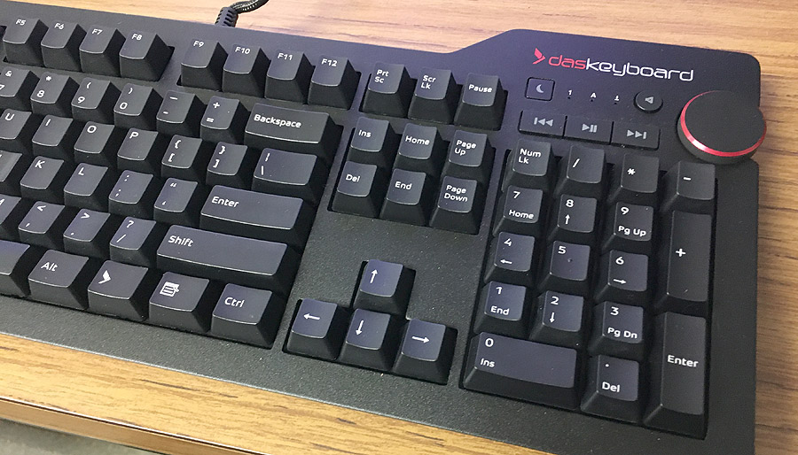
It has a modern layout, with some audio buttons and a volume control knob (very handy)
as well as a USB hub, which allows me to put the receiver for my wireless mouse very close
to the mouse itself, without tying up a front-panel USB socket.
Its switches are Cherry MX Blue, somewhat less clicky than IBM's mechanical ones, but that's OK;
it's a step toward modernity, though not a large step. Think of it as 1/3 of the way
from a 1980s IBM keyboard to a typical modern one.
The only thing I noticed missing was the label for the (Ctrl-)Break key. The key itself is there;
it's just Ctrl-Pause, same as always. At the command line, that is a slightly stronger interruption
than Ctrl-C. Many newer PCs have no such key at all!
I think the Das Keyboard Professional is going to be a keyboard I can use for years.
But along the way, I came across some gamer keyboards that didn't suit me at all.
Read on...
Permanent link to this entry
Why you might not want a backlit mechanical keyboard
The first Das Keyboard that I tried was one of their gamer models, with bright backlighting,
but there was a strange problem: the backlighting did not properly illuminate the shifted
characters (like ! @ # etc. above the numerals). These are exactly the key labels that I most
need to see, because I use other computers on which they are different.
The people at Das Keyboard explained that this has to do with Cherry mechanical switches.
Unlike laptop keys, which are fully illuminated when backlit, the Cherry switch is partly in the way
of the backlighting, and the whole key cap is not lit evenly. Unfortunately, translucent labels,
intended to be backlit, are quite hard to read when not fully illuminated.
I have seen the same problem with another company's gamer keyboard; it's not Das Keyboard's fault,
but it is a limitation. I would suggest that you choose either backlighting or Cherry mechanical
switches, not both.
Das Keyboard does make something even stranger, possibly the oddest computer peripheral I've seen
all month: a keyboard
with all the keys unlabeled.
This harks back to the way touch-typing was taught in the 1950s — you can type faster if
you can't look at the key labels, so they force you not to look at the key labels.
Fine if (1) you are appreciably eccentric, and (2) you always use the same keyboard.
(Even then, what if you need Scroll Lock for the first time in several days? You'd at least
need a picture of a labeled keyboard, as a "cheat sheet" for occasional use.)
I can't do it because I have to use other keyboards (three different ones during a typical day,
more if I go to a client's site). But it's an idea...
Permanent link to this entry
|
2020
May
5
|
Cautiously optimistic
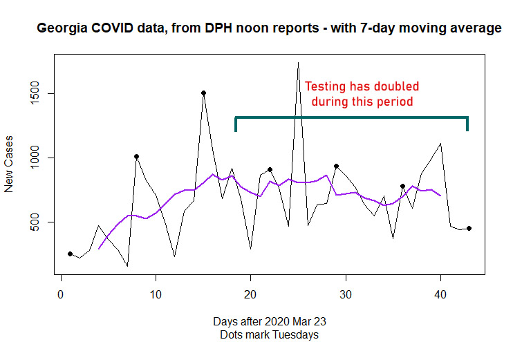
During the past two weeks, the Georgia rate of new cases detected per day has
held steady or declined a little, while the amount of testing has roughly
doubled (in a steady progression, not a sudden jump).
If the testing had been random, doubling it would have been expected to double the
number of cases found. Because tests are given to people suspected of having the
disease, the effect is not so large, but it is still real.
Testing is going up, but the number of new cases found is holding steady,
so I am convinced that the actual number of new cases is declining.
The day-to-day jumps are due to uneven reporting. They make it easy for the media
to report a sudden increase as if it were real. The purple line is a 7-day centered
moving average. It is a smoothed rendering
of the actual data, not a prediction or model.
Now the bothersome part. Georgia started relaxing its lockdown on April 24 and took
it further in early May. We should be just beginning to see new cases resulting from
increased exposure. It looks like many Georgians are unwilling to obey the remaining
rules and think it's time to party in the streets. How much harm will that do?
A few more days' data will tell us more than any amount of speculation or modeling.
Permanent link to this entry
|
| |
Ads by Google, based on your browsing history
|
|
2020
May
3
|
When a smaller image sensor is better
Professional photographers pay a premium for "full frame" cameras,
whose image sensors are the same size as 35-mm film.
Serious amateurs like me usually use APS-C cameras, whose sensors
are two thirds that size and cost a lot less.
Clearly, bigger is better. Right? Well, not always.
Before proceeding, I need to explain that in astrophotography, we often
use APS-C cameras because they match the size of our lenses and telescopes,
and also because larger individual pixels perform better in dim light.
But for daytime photography, read on.
Here is a comparison between a Nikon APS-C DSLR, whose sensor is 24 mm wide,
and an iPhone SE, whose sensor is just 4.8 mm wide.
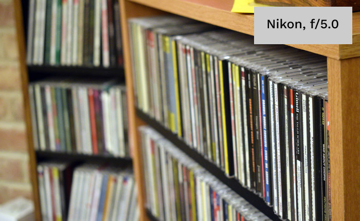
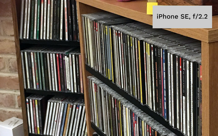
Look how different the depth of field is! Both were focused on the "Gimell" CD
that is about fifth from the right. In the Nikon picture, everything else is
seriously out of focus. But the iPhone rendered much of the scene reasonably
close to correct focus. If the f-stops had been the same, the difference would
have been even greater.
The reason is that the image sensor in the phone is much smaller;
the lens has a shorter focal length; and so there is more depth
of field.
Depth-of-field formulas are
in Wikipedia.
Crucially, if you assume the same field of view and object distance
(that is, taking the same picture with different cameras),
and the picture is ultimately going to be displayed at the same size,
then:
-
The lens focal length f is proportional to the sensor size.
-
The acceptable defocus (circle of confusion, c) is also proportional
to the sensor size.
-
Depth of field is proportional to c/f2, which
implies...
-
Depth of field is inversely proportional to sensor size.
-
It is also proportional to the f-number, so you get twice as much at
f/8 as at f/4. But identically exposed pictures use the same f-number,
so that is not usually a factor.
We've been through this already with film formats.
It's why Ansel Adams had to use f/64 on 8×10 sheet film to get the depth
of field that we get at f/8 on 35-mm film.
Now go from an APS-C DSLR sensor (about 24 mm wide) to the sensor in
my iPhone SE (which is "1/3 inch," an old size scale from TV cameras,
and works out to 4.8 mm wide).
The iPhone sensor is 1/5 as big, so it gives 5 times the depth of field
at the same f-number. To equal an iPhone at f/4 (which is a rather wide
setting), a DSLR would have to stop down to f/20.
I've been making workshop videos — right now just to entertain my grandchildren,
but with the idea of eventually putting some astronomy- or electronics-related
material on YouTube — and depth of field has been a real problem.
(In a moving picture, you can't keep things from going slightly out of
focus as they move around.)
So I decided to move from a DSLR to a camcorder with a 1/5-inch sensor.
A radical change! More about that below.
Permanent link to this entry
Camcording
As if there weren't enough cameras of one kind or another in this house, we've
bought a camcorder ("as opposed to an oxcorder," I quipped, "which would be for the
other university").
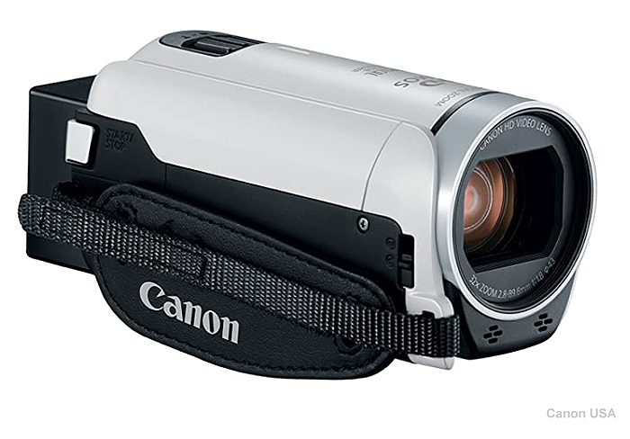
It's a
Canon Vixia HF R800,
and I got it refurbished from Canon at a great price.
Wait a minute. Don't professional videographers use either DSLRs (which now all have video modes)
or pro video cameras with DSLR-like sensors?
It's true that they very often do. But that's mainly for formats larger than standard HDTV
(1080×1920), such as 4K.
There are still semi-professional camcorders for 1080 format with small sensors
(the
Vixia HF G40 for instance).
I had been shooting video with my Nikon D5300 DSLR, and I had two concerns.
One was depth of field (see above). The other was autofocus.
With fixed focus it works beautifully, but when I'm shooting video,
the autofocus system, designed for
sports photography, tends to overshoot, back up, overshoot in the other direction,
and sometimes lose focus totally.
It's not practical to do everything in fixed focus, and I was getting tired of
watching the autofocus system dance a tarantella. The Canon camcorder does much better.
Because of the great depth of field, focus is less critical to begin with, and
the autofocus goes straight to the correct setting without dancing back and forth.
I am told that Canon DSLRs are also better at this than the Nikon D5300, but I can't confirm
this. I do keep hearing from people who are producing good video with DSLRs, and every
time, they're using Canon. I should put my Canon 60Da through its paces; it has the wrong
spectral response for daytime photography, but it will tell me how Canon handles video in a DSLR.
Permanent link to this entry
|
2020
May
2
|
Life in strange times

This is what shopping looks like these days. This shopping center is actually
open, at least mostly. Shoppers are expected to wear face masks and not to mill
about in crowds. There are actually rather few shoppers in evidence.
At the far end, Best Buy is doing curbside pickup — you order things and pay
for them online, then drive up and receive the merchandise. I have made a couple
of purchases that way.
On the other side of the Epps Bridge Parkway, Kroger and Home Depot are doing a
thriving business, but both of them limit the number of people who can be in the
store at once, and they have designated one door as the entrance and the other one
(far away) as the exit.
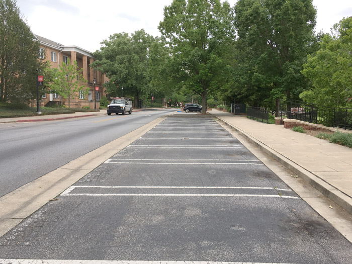
The University of Georgia is more closed than I have ever seen it, though faculty have
access to their offices.
It's torn up by road construction, and also, while driving through the other day,
I had a bad experience with a stuck traffic light.
Naturally, this being North Georgia, even when there is no other traffic in sight,
other impatient drivers will spontaneously appear the moment you get stuck at a red light
that won't change.
I'm acutely aware that Melody, Sharon, and I were unusually well set up to have things go smoothly
during the restrictions. I was already set up to work from home, and both of my
clients (FormFree and my defense work) are prospering.
Because of their long-term health problems, Melody and Sharon were already accustomed
to staying home a lot.
To those who are stressed by the restrictions, my advice is, do something that makes
other people better off, whether helping local people in difficulty or just keeping
the economy and civilization rolling along. Respond to actual needs, not
speculations about how horrible someone thinks it's going to be.
Permanent link to this entry
Contentious times
Facebook and e-mail are less of a constant clamor than they were two weeks ago, but
that may be partly because I've unfollowed (tuned out) people whose hobby is spreading
the most frightening speculations they can find.
The saddest thing about it all is that I don't want to lose friends just because
I won't assent to their newly adopted unpopular opinions — but a few times lately,
that has almost happened.
You need to be able to watch a bandwagon and see where it goes
without jumping on it. You can consider an alternative theory — even consider
many of them! — and see where the evidence leads, without having to believe
it and start promoting it.
The other thing to keep in mind is that when you're between a rock and a hard place,
neither the rock nor the hard place will go away by being ignored.
We have both an immediate health risk and an economic risk, which will turn
into a health risk. Neither one goes away when you focus on the other.
Permanent link to this entry
Blah blah blah MILLION blah blah blah!
Have you noticed that news media often include a big number in a headline in order to
startle you, without giving you anything to compare it to? You're supposed to go away
thinking that the number is frighteningly large, but they haven't actually said.
Permanent link to this entry
Not out of the woods yet
The colored lines in the graph are not models or predictions. They are centered
moving averages to smooth out short-term fluctuations. The dots mark Tuesdays to
help you look for weekend underreporting and subsequent catch-ups.
While I sincerely hope we're on the downslope, that (in Georgia) is no longer so clear.
This latest upturn in new cases per day is a bit early to have resulted from the
relaxation of restrictions that took place around April 24 and May 1. Maybe it's the result
of increased testing. The death rate has not increased (but then, it's a lagging indicator).
One hopeful possibility is that although more cases of COVID-19 are being detected, they are
milder cases. Maybe testing is no longer reserved for just the sickest.
I saw a report (which I now cannot track down) that the national hospitalization rate
is no longer growing the way it was.
If so, that's good news, but it doesn't mean the disease isn't real and isn't killing
people. Please, everyone, keep washing your hands, wearing masks, and avoiding crowds.
We need to get the spread rate down and keep it down.
Permanent link to this entry
How America is going to change
Here are some thoughts about the long-term impact of COVID-19 on our nation, economy,
and culture.
Survival means being willing to admit that the future will be different.
A lot of people are going to have different jobs than they used to.
Not worse jobs, just different ones. Remember how I cautioned that we would never have
as many builders and auto workers as we did back in 2007, when we were trying to build more
houses and cars than anybody needed? Something similar is going to happen.
People will move, change careers, and change long-term plans.
That doesn't mean their lives are ruined; many will end up better off.
Left in the dust will be those who really feel that their whole life was ruined by
not having a traditional high school graduation, or something like that.
I think that largely, the epidemic will push economic changes that were already
under way.
One of them is the decline of "shopping" as a pastime.
In 1800, and in many places as late as 1950, most shopping was like going to the auto
parts counter: You told them what you wanted, and if they had it, you bought it.
They would display other goods to entice you, of course, but you were supposed to
have something already in mind when you went into the store.
In the 1850s, the
Paris department store Le Bon Marché introduced the idea of an opulent department
store in which you were welcome to just browse around.
This became connected with "fashions" and "sales" — a deliberately irregular supply,
with occasional bargain prices,
to encourage you to keep coming in.
By 1960 that was a major part of the American lifestyle, but it has been fading for a
while now (look at the decline of shopping malls).
Rather than go wander around looking for a "sale," people would rather find, via the
Internet, the exact item they're looking for, or browse online in a way that is much more
thorough and revealing than walking around a store could be.
Tele-work is also here to stay.
Just as the telephone 100 years ago led companies to move their main
offices away from the factories and into the financial district,
today's companies don't even need the workers to be in the same state!
I've been working with two companies that operate this way for more than ten years.
We've just seen a real upsurge in video conferencing.
Maybe business travel is going to go away.
I'll miss it, but I'm sure nobody will miss the expense!
From both of these, it follows that where you live is going to be much less important.
"Outsourcing to Kansas" (as Jeff Duntemann put it) is going to happen.
That, and highly skilled workers living 50 to 200 miles away from a major city
(and not commuting) rather than living in it.
Maybe you need to go to the city every so often, but not every day.
The businesses and industries that really do exist in every medium-sized town
are still going to be there, of course, and in smaller towns they may find they
have a more prosperous and sophisticated clientele, which is all to the good.
We will be permanently wary of unnecessary crowding, just as the polio
epidemics left Americans permanently more concerned with bathroom cleanliness.
And for both of the reasons I just mentioned, and others, New York City will
never be what it was. The practical benefits of being in the nation's largest
city have been declining for maybe 50 years.
When I was young, being in New York or London put numerous things at your fingertips
that you would never have even heard of anywhere else.
I'm glad to have spent time in both places as a young adult, but the world is
different now.
The Internet puts everything at your fingertips no matter where you are.
Meanwhile, people are going to be positively afraid of New York because of
the crowdedness.
Sadly, higher education is taking a severe blow
and a surprising number of small colleges will close, and large ones will scale back.
This means there will be a surplus of faculty members on the job market.
We've already seen the job market for Ph.D.'s decline (except for scientists in
industry).
In the 1960s and 1970s, universities expanded rapidly and needed faculty;
by 1982, when I got my doctorate, I think this expansion was continuing by inertia,
not because of any real force driving it; and since then, faculty positions have been
much harder to get.
We're going to see people with doctorates in philosophy or
literature working in the business world.
I hope businesses feel enriched by the new influx of brainpower. But my fear is that
there may be anti-intellectualism — resentment of useless eggheads.
After all, postmodernists in the humanities have been telling people for thirty
years that the quest for knowledge is pointless; what if people believe them?
In the applied sciences, of course, the benefits of higher education are much more
evident.
Permanent link to this entry
|
|
|
This is a private web page,
not hosted or sponsored by the University of Georgia.
Copyright 2020 Michael A. Covington.
Caching by search engines is permitted.
To go to the latest entry every day, bookmark
http://www.covingtoninnovations.com/michael/blog/Default.asp
and if you get the previous month, tell your browser to refresh.
Portrait at top of page by Sharon Covington.
This web site has never collected personal information
and is not affected by GDPR.
Google Ads may use cookies to manage the rotation of ads,
but those cookies are not made available to Covington Innovations.
No personal information is collected or stored by Covington Innovations, and never has been.
This web site is based and served entirely in the United States.
In compliance with U.S. FTC guidelines,
I am glad to point out that unless explicitly
indicated, I do not receive substantial payments, free merchandise, or other remuneration
for reviewing or mentioning products on this web site.
Any remuneration valued at more than about $10 will always be mentioned here,
and in any case my writing about products and dealers is always truthful.
Reviewed
products are usually things I purchased for my own use, or occasionally items
lent to me briefly by manufacturers and described as such.
I am no longer an Amazon Associate, and links to Amazon
no longer pay me a commission for purchases,
even if they still have my code in them.
|
|