


Photoshop for Aerial Photographs
Copyright 2006 Michael A. Covington.
Photoshop for Aerial Photographs
Copyright 2006 Michael A. Covington.
|
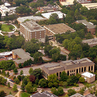
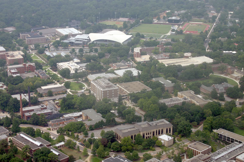
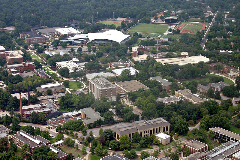
From this:
Pictures taken out the window of an airplane usually look hazy and washed-out. These faults are easy to cure by processing the image with Photoshop. In what follows, I'll show you how I processed an aerial photograph with Photoshop CS. Most of the features needed are not advanced, and most other image editing programs should be able to do the same work. First, take the picture! I used a Canon Digital Rebel in Av (aperture-priority) mode at about f/8 in order to get a short exposure time (about 1/400 second), eliminating vibration. Here's what the original picture looked like:
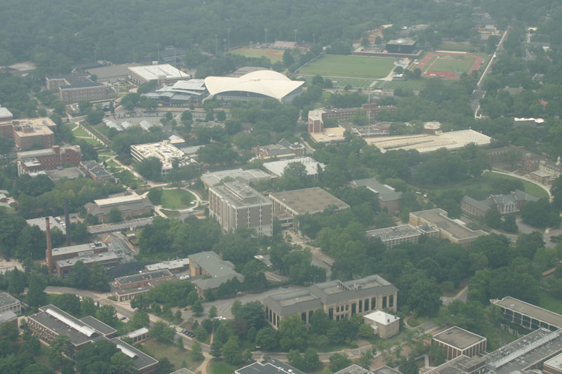
As you see it, the picture has already been cropped a bit, and downsampled to 800 × 533 pixels (0.4 megapixel) for display on the Web. In real life you'll probably be working with the original 6-megapixel image in order to eventually make a large, sharp print. To cure the gray haze, just choose Image, Adjustments, Auto Levels:
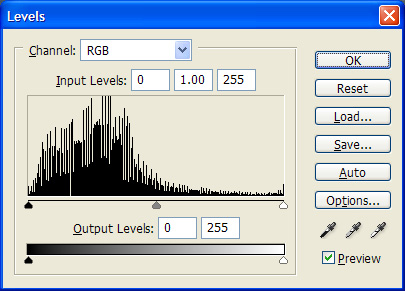
But now the midtones are too dark. Hit Ctrl-L and you'll see a histogram something like this:
Move the middle pointer to the left, toward the hump:
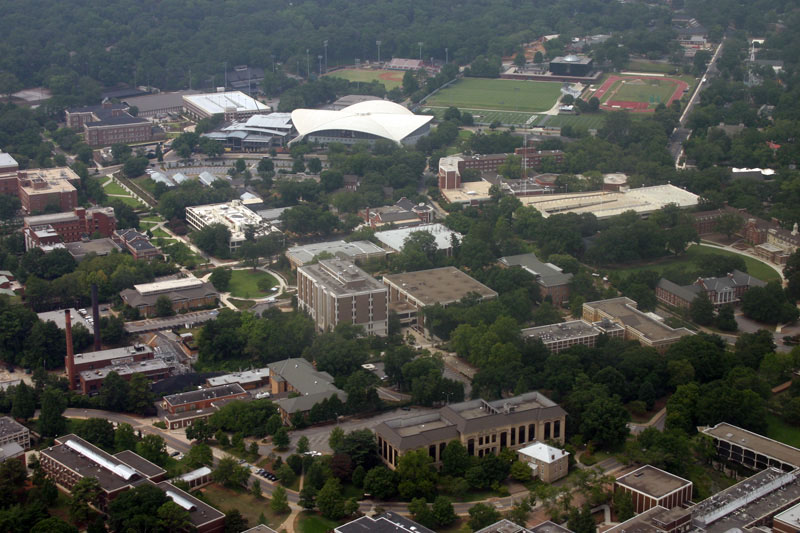
Now the picture is more legible, but the contrast is still low. Don't worry; we'll fix that. Here's what we have so far:
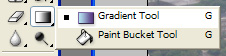
The next step is optional and somewhat advanced. Notice that the picture has a contrast gradient. The upper part has less contrast than the lower part, due to a greater amount of haze. Depending on the intended effect, you may or may not want to correct this. If you want to try to correct it, here's how. The technique is very similar to vignetting correction and you may want to read that article also. Right-click on the Paint Bucket tool in the Photoshop toolbar, and choose the Gradient Tool:
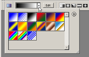
At the top of the screen, click on the Gradient Picker (shown here) and make sure the black-to-white gradient is selected:
Then, still at the top of the screen, make sure the linear (left-to-right) gradient is selected, and set the gradient mode to Color Burn and the opacity to about 25%, and make sure Reverse, Dither, and Transparency are unchecked:
Notice that the Gradient Picker, at the far left of this bar, displays a checkerboard pattern when you set the opacity to less than 100%; that's normal. Finally, using the Gradient Tool, draw a line from the middle of the top edge of the picture to the middle of the bottom edge. Voilà!
Now, whether or not you chose to correct the gradient, let's work on edge enhancement. The idea is to exaggerate differences between neighboring pixels to sharpen the image. The easy way to do this is just to hit Effects, Sharpen. And if you are working at web resolution, that's probably all you need. Here's the result:
But if you're editing the full multi-megapixel image from the camera, hitting Sharpen will probably not have enough effect. You don't just want to deal with adjacent pixels; you want to look several pixels in each direction to enhance local contrasts. To do that, go to Effects, Unsharp Masking. Set the percentage to a high value, such as 75%, so you can see what size of detail you are working on. Then vary the radius until you get the most increase in visible detail. Finally, turn down the percentage to a reasonable value, so the picture doesn't look unnatural. Even our example picture benefits from just a bit of unsharp masking (15 pixel radius, 30%) to separate the buildings from the background:
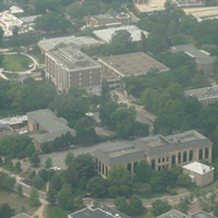
Working with a full-resolution image, you'll probably want to do several unsharp masks at different radii, from maybe 3 to 100 pixels, to pep up details of different sizes. Last, take a good look at the color balance. In this picture, it's rather blah, with low saturation and a bluish cast. Image, Adjustments, Auto Color doesn't help. Instead, I went into Image, Adjustments, Hue/Saturation and turned up the saturation slightly, then went to Image, Adjustments, Color Balance and added some yellow and red to the midtones. Here's the finished product:
Enjoy! |
 to this: